You’ve probably seen the ad: “If we don’t get your content one million views in 30 days, you don’t pay.” It sounds bold. Risk-free. Maybe even revolutionary. But here’s the catch; they never said organic views. Paid ads can rack up a million scroll-by impressions in...
Build a Brand With Us: The Power of a Strong Brand Image
When we launched Monark Wild Rice, the first question we asked wasn’t, “What should our website say?” It was, “What should this brand look and feel like?” That’s because a strong brand image isn’t just about visuals. It’s your first impression, your shelf presence, your story, and your value proposition, all in one. It lays the foundation for everything that follows.
In this instalment of our Build a Brand With Us series, we’re taking you behind the scenes of how we created Monark Wild Rice’s visual identity and why that process comes first when building any brand. From logo formats to colour choices and packaging inspiration, we’ll break down the key branding elements that make your product recognizable, trustworthy, and ready to grow.
Why Visual Identity Comes First
Before we designed a single label or wrote a line of website copy, we focused on building a cohesive visual brand identity. In a crowded marketplace, where customers make snap judgments in seconds, your visual identity is your handshake. It’s the “hello” that determines whether someone stops and looks closer or keeps walking.
A strong brand image is how your audience starts to recognize and remember you. It influences perception, drives emotional response, and reinforces what you stand for. It also supports brand recognition, which is one of the key pillars of long-term customer trust.
Your visual identity communicates your brand value before you ever speak a word.
Breaking from the Norm: A Visual Strategy That Works
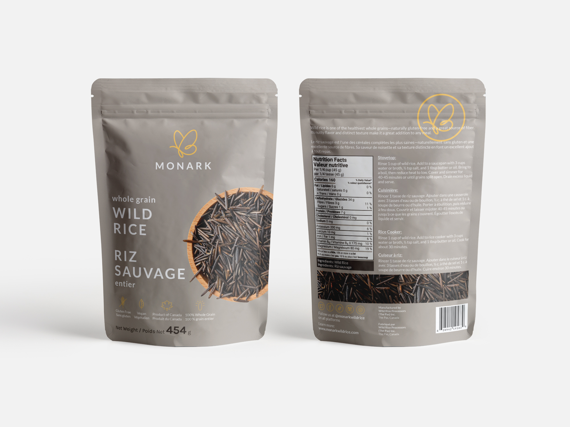
Most natural food packaging leans heavily on tropes: bright greens, faux-handwritten fonts, and busy, overstated design. But we knew from the beginning that we wanted Monark Wild Rice to stand out by being understated.
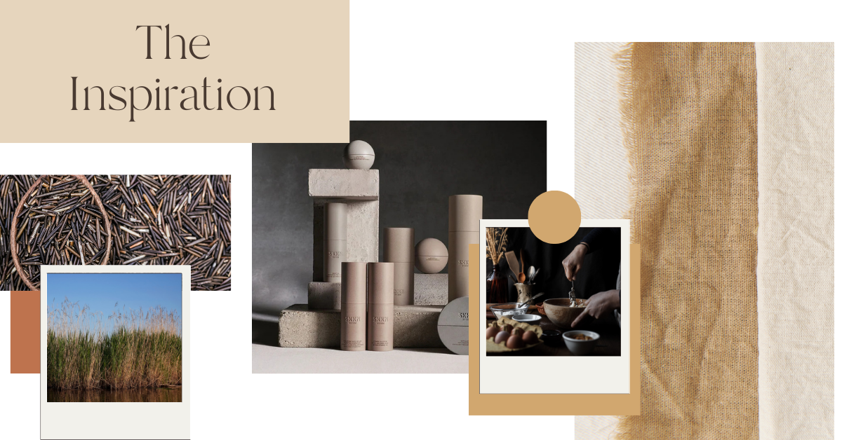
That’s when we drew inspiration from a surprising place: SKKN BY KIM, Kim Kardashian’s skincare line, which made its appearance in 2022. While we don’t endorse her or the product line, we recognized the genius behind the branding.
The SKKN launch marked a shift in aesthetic-forward packaging that emphasized tone, texture, and restraint. It was one of the first mainstream examples where the packaging looked like something you wanted to display, not tuck away. That idea, that minimalism and thoughtful design can cut through noise informed our decision to pursue a muted colour palette that echoed the natural tones of wild rice itself.
Color Choices That Tell a Story
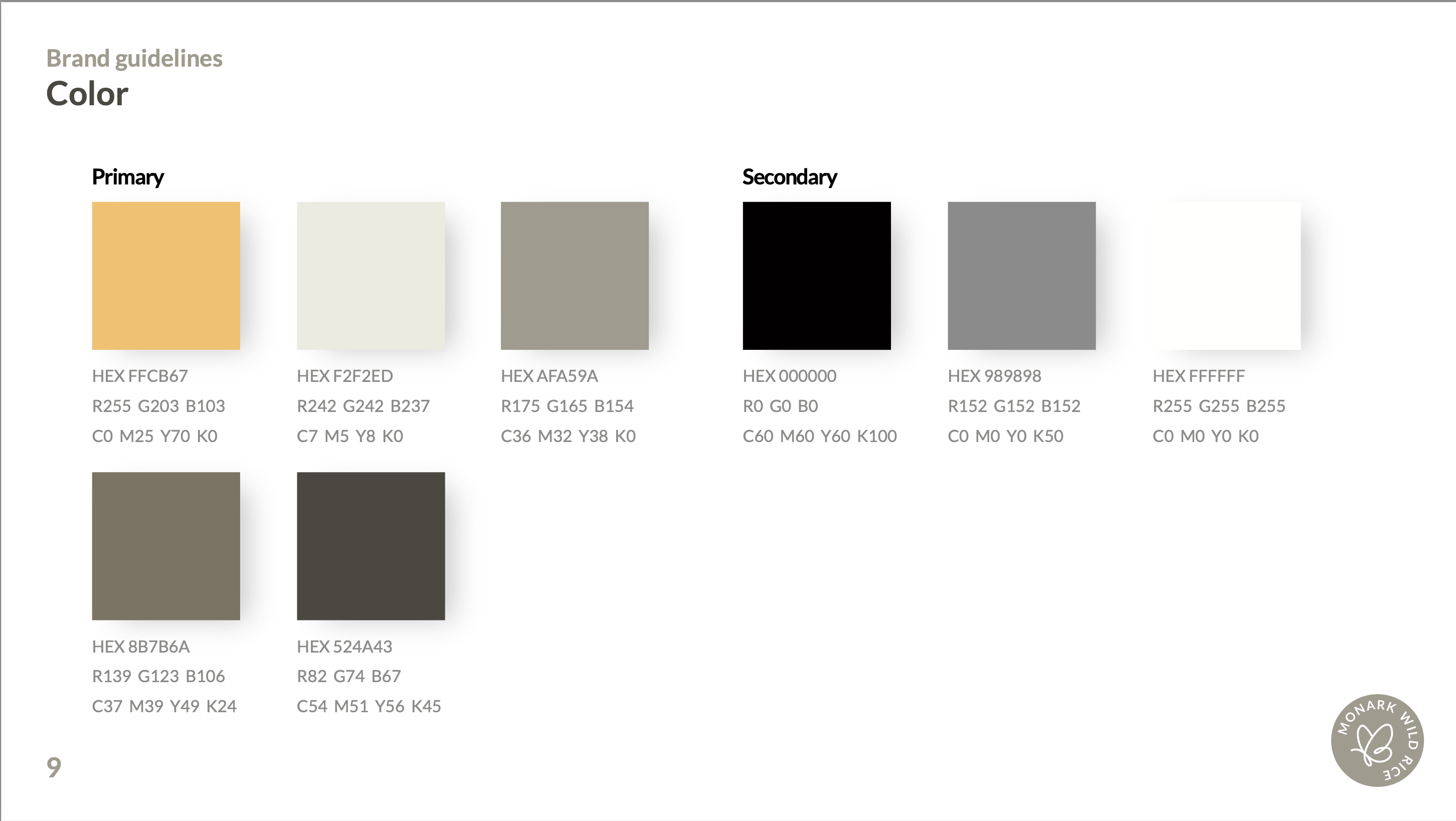
Color is one of the most powerful branding elements. It evokes mood, creates memory, and can make or break your shelf presence. For Monark Wild Rice, we didn’t want synthetic vibrancy. We wanted a natural, earthy color palette that reflected the product’s origins: wild-grown and harvested in the pristine lakes of Northern Manitoba and Saskatchewan.
We chose tones that are muted to reflect the grounded, honest nature of the brand, layered to reflect the complexity of wild rice and its cultural and ecological significance, and minimalist to stand out on shelves and in digital spaces where other packaging is loud. We wanted customers to be drawn in not by gimmicks, but by design that felt intentional, mature, and premium.
Choosing the Right Designer
With the vision clear, we went to 99designs and found Blukki, a talented designer based in Serbia. Blukki’s portfolio showed us a strong grasp of minimal design principles and a sensitivity to color and form. It was exactly what Monark needed.
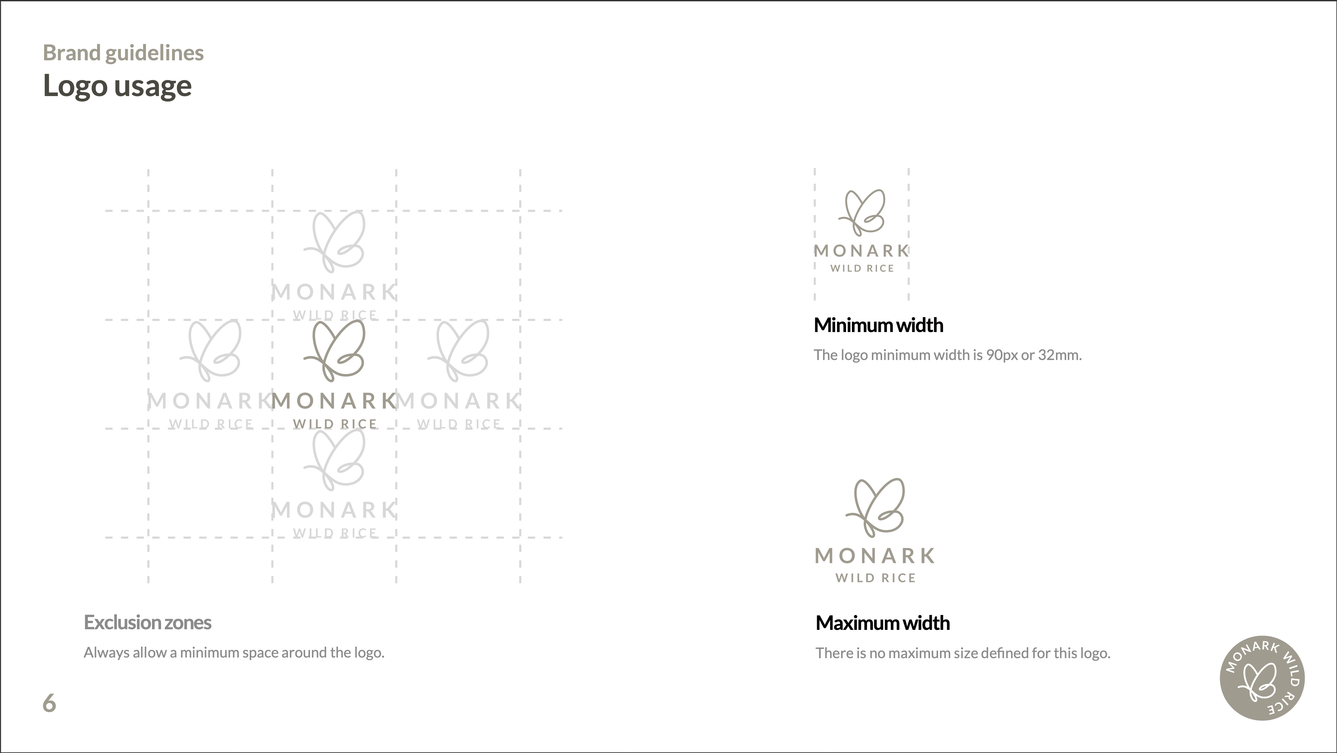
We worked together to build out a complete brand identity system, which every serious brand should have before launching. This included multiple logo variations in color, black and white, inverted and single-color options, and both horizontal and stacked orientations. We also ensured we had the correct file types: AI files for scalability, PNGs for transparency, JPEGs for web use, and raster formats for printing. Our brand guidelines documented logo usage, minimum sizing, spacing, approved color hex codes, and font pairings to keep everything consistent and professional.
The Role of Brand Image in Building Trust
Consumers make decisions quickly, and your brand image is what gives them a reason to pause. When you build a strong brand identity, you create familiarity. Over time, that familiarity becomes trust. Every time your packaging shows up in someone’s pantry or your logo appears in their feed, you reinforce who you are. But for that to work, everything needs to look and feel like it belongs to one story.
We knew we couldn’t communicate Monark’s quality or values if the brand looked like every other rice product on the shelf. That’s why we started here.
Brand Image Is Strategy, Not Aesthetic
A common misconception is that branding is about making something “look good.” But good design without a strategic backbone is decoration, not identity. Every design choice for Monark was tied back to product positioning as a premium, natural, grounded brand; our audience, which is made up of health-conscious, design-aware consumers who value quality; and our retail context, where we are competing with louder brands on crowded shelves.
Your brand image should always support your business goals.
Why You Should Never Skip This Step
We often see new brands jumping into website builds or packaging mockups without a solid visual identity in place. It creates inconsistency, confusion, and costly rework. By starting with a strong foundation, Monark Wild Rice was able to build packaging that aligns with its values and stands out in-store. We launched a website with cohesive visuals, and every piece of social content we created carried consistent brand recognition. As the business expanded, we could easily onboard collaborators with clear brand files, streamlining communication and ensuring consistency at every touchpoint.
Next in the Series
In our next Build a Brand With Us post, we’ll show you how we applied this visual identity to our packaging design and why we chose to partner with a Canadian printing company, the process of refining our final product, and the key lessons we learned about what not to do.
Want to build a brand that looks, feels, and performs like it belongs in 2025? Follow along, ask questions, or reach out. We’re showing our full process to help you build yours.
Smart Businesses Double Down On Social Media When Everyone Else Pulls Back
When Fear Spreads, Focus Wins At Monarch Social Media, we’re hearing a familiar pattern: business owners are becoming cautious. And that’s understandable. The headlines are constant, the layoffs sound alarming, and the message online is clear: cut back, protect cash,...
